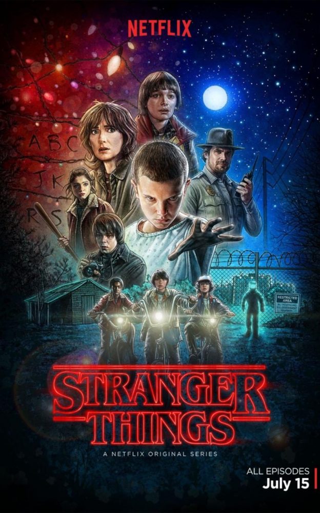
Typography of Stranger Things
29 July 2016
There’s a lot for a designer of a certain age to get excited about with this summer’s Netflix TV sensation “Stranger Things”. But in amongst the retro 80s posters, the big hair, the throbbing synth soundtrack and multitude of movie references, literally the first thing to catch the eye is the title typography.
According to the Hollywood Reporter, the series creators put a lot of thought into the opening titles, drawing on the covers of Stephen King’s early 80s paperbacks to decide a glowing red outlined form of ITC Benguiat. The font’s creator, the legendary font designer Ed Benguiat, wasn’t aware of the use until The Telegraph contacted him for this article. One of the founders of International Type Corporation, Benguiat (the man) designed Bengiat (the font) in 1978, but he has given this use his seal of approval and is quoted as saying “It’s rather appropriate… It lends itself to the feeling of the titles.”
We have been designing professionally for over 25 years, so it’s fair to say that we have used Benguiat on more than one occasion. It even appears on some of our sister company’s typographic wall art, just showing that we can still keep ahead of the graphic design curve!
Find out more about the life of Ed Benguiat in this Telegraph article.

